Norway’s Sleek New Passports Contain a Surprise Design Feature By Kristin Hohenadel

Courtesy of Neue Design Studio
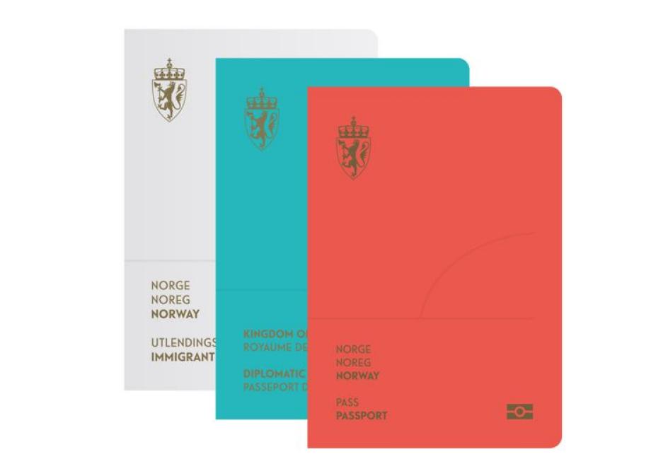
The winning Norweigan passport cover redesign from Neue Design Studio includes an update of the current red passport, plus a blue version for diplomats and a white version for immigrants.
On the heels of its new pixelated banknotes, Norway has now overhauled the look of its passport with a minimalist redesign that has a surprise feature on the inside.
When the passport is held under a UV light, a scene of the Norwegian landscape turns from day to night, revealing swirls meant to evoke the spectacular northern lights, and hidden text appears.

Courtesy of Neue Design Studio

Courtesy of Neue Design Studio
The winning design from Neue Design Studio was chosen by a jury for a design competition held by the country’s national police, who wanted to update the security features of its current passport, whose cover has all the stodgy bureaucratic pomposity of your average passport design. The new passport cover has a sleek, minimalist look (but not quite as minimal, it turns out, as this Norwegian passport from 1923). It includes an update of the current red passport, a blue iteration for diplomats, and a white and pale gray version for immigrants.
According to the studio, a translation of the generic-sounding design brief was “to find a unique concept with excellent design qualities and a theme that is widely accepted, presented through an appropriate and functional solution. The background for the competition was to increase the security of Norwegian passports, ID cards and travel document.” (Unfortunately, in the name of security, details about the design, color scheme, and UV light trick were not forthcoming. Neue Design Studio's Gorill Kvamme told me in an email: “We are a bit restricted with the information we can share, so the press release is the only document available, at least for the time being.”)
The widely accepted theme of the Norwegian landscape won the day.
“Nature has always been an essential part of the Norwegian identity and tradition,” the designers wrote in a press release. The jury called the winning look “the competition's most subtle and stylish solution. ... Aesthetically the landscape motifs have been given a distinctive look. The jury appreciates the simplicity of the solution.”


No comments:
Post a Comment